I just received a whole bunch of new swatches from spoonflower! It's happiness in a soft paper package.
First, is a
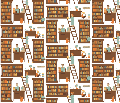
Library Collection I made, complete with John at his desk, bookshelves, chewed on pencils and a library cat. I don't like the house plant fabric very much, but that sure is a nice yellow.
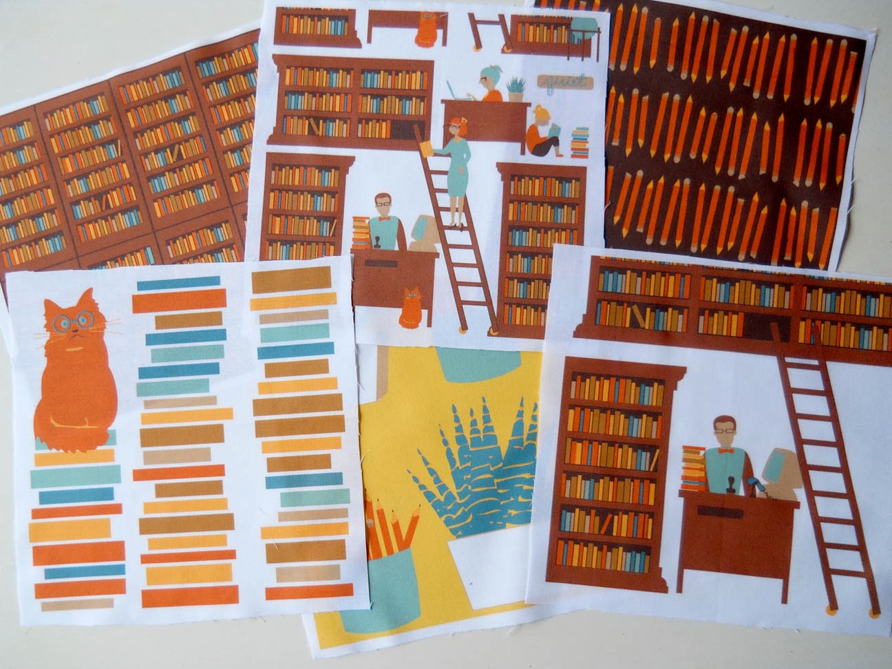 |
| six prints |
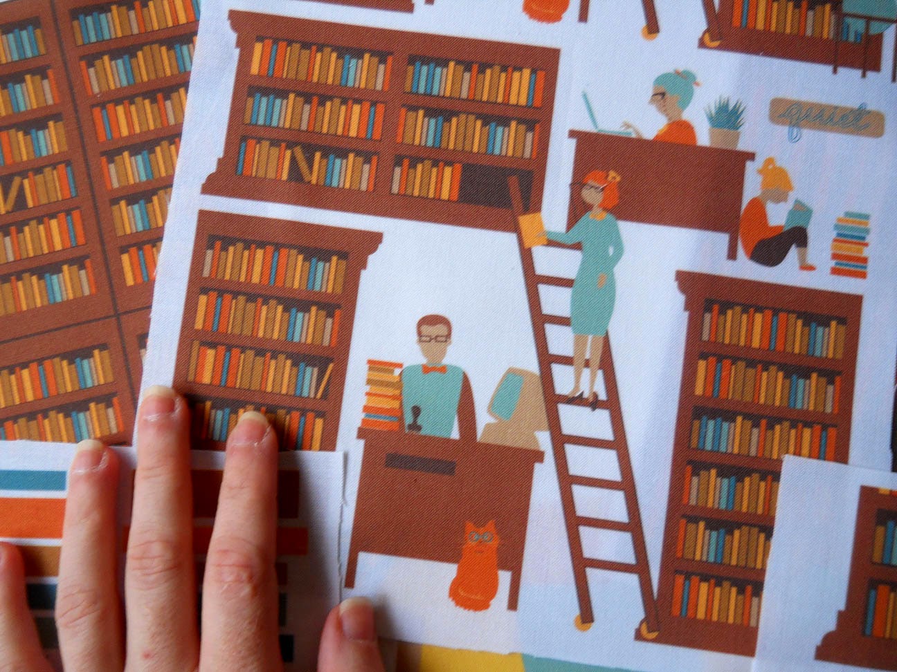 |
| the complete library scene |
 |
| library cat |
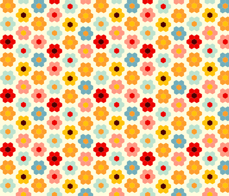
I don't have any plans for these, they were just fun to make. Some of these are much nicer when you can see the repeat. Like this one.
This set was meant to be some simple designs for upholstery in our
new house.
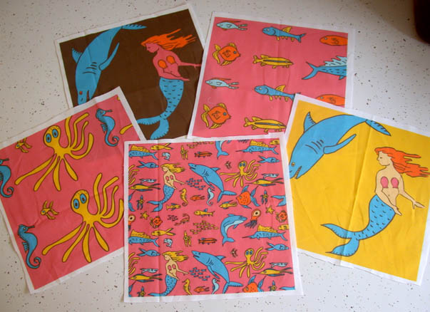
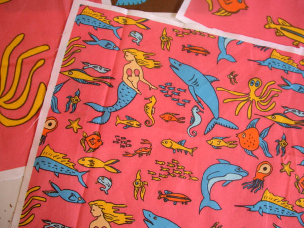
I haven't made any changes to my
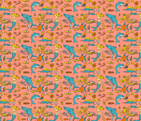
Sea Creatures Collection, but I got some swatches for a little swatch - stocking stuffer - project I have in mind. More about that coming up in a few days. In the meantime, you can check out this collection from a few years ago
here.
And this was supposed to be a whole fairy tale collection for my sister, the storyteller - but I got distracted and never finished it. I did put together a little Baba Yaga House in the Woods, which I think is kinda cute. It's begging to be developed into a collection. We'll see.
I also made these two sort of random prints that are now in my
Uncollected Collection. I think this
nature walk print might be one of my strongest ever. We're really into nature collections around here, so I had a shelf full of things to draw from. When I received the swatch I noticed a fine white line on one side of the repeat. I was able to quick fix the image and upload the revision. Thank goodness for swatches!
A lot of the detail in this one is lost when you look at the pattern on the fat quarter scale. I think that's my only complaint with Spoonflower - prints on a smaller scale don't look as good on the website as the larger prints. So I'm more drawn to the easy to see large prints, but practically I rarely sew with large prints. I wish they had a zoomed in small scale print option!
The other uncollected design was a pretty little
fall print just for fun. There were two visible white lines in this one. They're much harder to see on the computer, but obvious in print. Now I'm stretching my background color beyond the edges of the art board to ensure that doesn't happen again.