
Available in the shop now.

Here are six prints from my Jade in My Window designs. I have several other variations of colors that I didn't print because really I could have printed an infinite number of these, but I settled for this six.
This first pair are sort of the originals. The one on the left was the very first design that spawned all the others. The yellow is from the same design, but with a different repeat so that it has a diagonal thing going. I like both, but I'm glad these were just the beginning because I think the designs got better.

This pair is an all over print of the jade plant. I got so many lovely comments about these last time, even though the red was wrong with the first print. Now that I've corrected it, people keep saying, "oh yeah, that is better!" I love the red - it reminds me of a Matisse painting.

This image shows the before and after red. The one on the left is the first one I ordered, and it's a little orangey. The second one is right on. :)

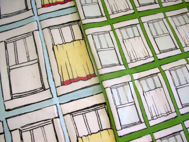
And the last two feature just the window without the plant. I really like the green, but I'm digging the color on the blue one, too.
I'll post tomorrow about what I'm making with the fabric so you can see it in action. But I've also listed a few fat quarters in my shop, so you can play with some, too - and I just might be having a little give away. So stay tuned.
2 comments:
For some reason when I thought "what would I use these for" I kept thinking of decorative type ideas. I think several would be good for a heavier weight fabric, like duck cloth (I think that's what it's called). I can see several working well for outdoor chair cushions, or maybe a cushion on a swing. I would use the "blue background window with plant" print for a pillow. I also thought several of the prints would lend themselves well to pot holders, aprons, or, funny enough, tea towels.
To be constructive, my least favorite is the red background jade print. I just found that the design didn't pop out enough to me, so I found myself glancing over it pretty fast to see the others instead. I wonder what adding white, or other lighter color into the design would do for it. Possibly doing the whole design in a lighter color.
My favorite is probably a toss up between the other four prints, with the cream print falling out of the mix. I like it, but it doesn't stand out as well as the others to me. I think the "plant on light blue background" would be a good fashion fabric. On something with a good drape, it could be a really pretty dress I think.
It's hard for me to gauge the size of the prints, but a larger size print to fabric ratio I actually think could look really cool as a curtain, especially a cafe style curtain for maybe a kitchen or bathroom. It's a bit tongue and cheek, but I'd like it!
I actually think the "green background windows" and "cream windows" would look really cool as wall paper too.
Hope that wasn't too much feedback!
Elaine
I love the blue background with the windows... and the bit of red. I would use it for a peasant type shirt for my granddaughter Sophie, the patter in Anna Maria's book. I also love the green windows... love that happy grass green!
Post a Comment